Apple has officially begun rolling out Apple Music 7.0 for Android on the Google Play Store, bringing a comprehensive visual overhaul anchored by the company's translucent "Liquid Glass" design language. The update follows roughly a month of beta testing and delivers long-awaited interface parity with Apple’s native platforms, alongside a complete retirement of the streaming service’s iconic red branding in favor of a modern monochrome aesthetic.
For Android listeners, this release represents one of the most substantial architectural and visual updates in the history of the app. Rather than treating Android as an afterthought, Apple has pushed its flagship desktop and iOS visual guidelines straight to Google’s mobile ecosystem.
What Apple Rolled Out in Version 7.0
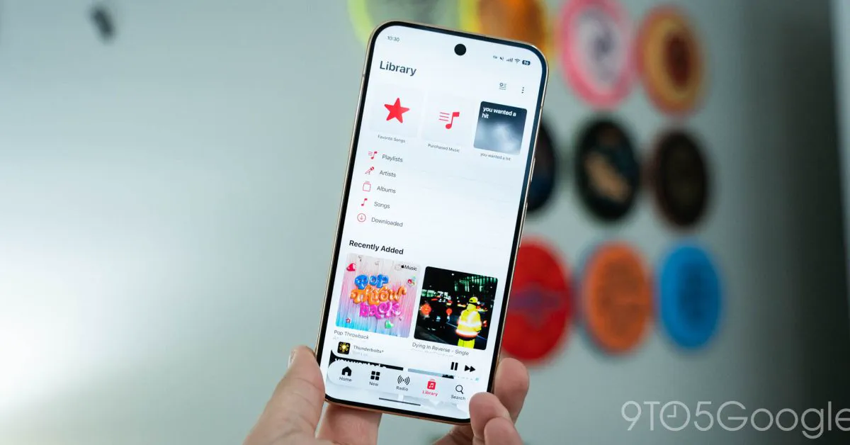
The marquee visual transformation in Apple Music 7.0 is the implementation of floating, translucent UI components inspired by Apple’s Liquid Glass style. At the bottom of the screen, the static navigation bar has been replaced by a rounded, elevated container that hovers above content, letting album artwork and interface colors blur subtly behind it as users scroll through tabs.
Directly above the main navigation dock, the mini-player has undergone the exact same treatment. Instead of anchoring directly to the bottom tab bar as a merged sheet, it now exists as an independent floating card with matching rounded corners and blurred glass refraction.
Beyond navigation elements, the update also introduces system-level polish across the entire interface. Apple Music 7.0 adopts true edge-to-edge rendering, drawing content directly beneath Android's transparent system status bar at the top and the gesture navigation pill at the bottom. Top navigation headers have been flattened so that page titles and contextual action menus share a single horizontal line, tightening the vertical whitespace.
The New Monochrome Identity and Accent Overhaul
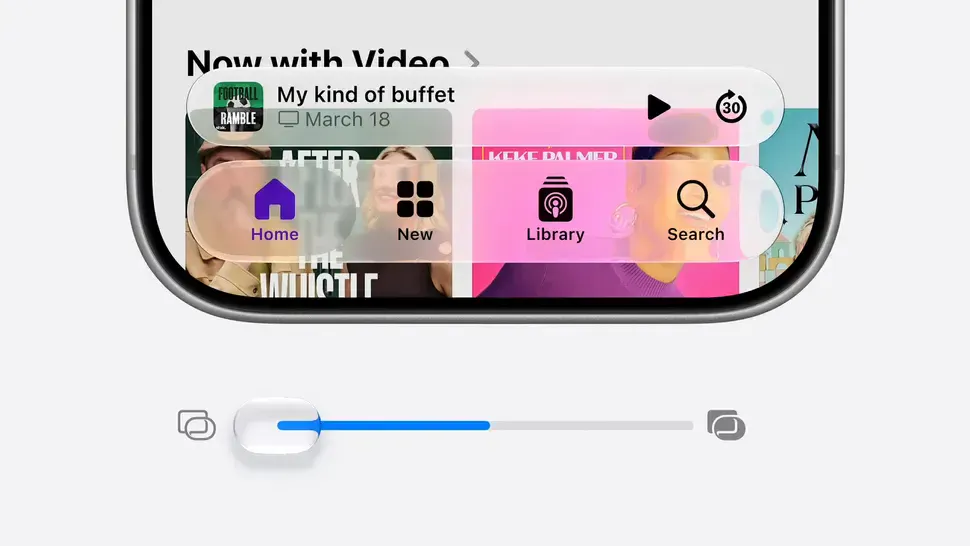 Photo: androidheadlines.com (source)
Accompanying the structural redesign is the official rollout of Apple Music's rebranded visual identity. The bright magenta-red background that characterized the app icon for over a decade has been retired. It is replaced by a minimalist black-and-white icon featuring a fluid music note designed to complement translucent interfaces.
This shift away from red cascades throughout the internal app styling:
- Blue Accent Tones: The active navigation tab and highlighted menu selections now illuminate in blue rather than magenta-red.
- Monochrome Containers: The three-dot overflow menu buttons across tracks and albums have shed their red tint, moving into neutral, circular background pills.
- Darker Home Screen Widgets: Android home screen widgets now sport dark, neutral backgrounds rather than colorful red accents.
- Sound-Reactive Brand Animation: Splash screens adopt fluid ripple graphics developed in collaboration with electronic producer Fred again.. and NEST Acoustics, which physically etched sound frequencies into mineral oil without using computer-generated imagery.
Detailed Changes: Artist Pages, Library, and Settings
Apple has not just moved icons around; several core operational screens received targeted enhancements designed to improve media discovery and organization.
Artist profiles received the most dramatic rework. When viewing an artist page, the header now showcases high-resolution, full-page artwork with dynamic backgrounds that extract color tones directly from the artist’s banner image. The page features a more prominent primary Play button, artist-curated spotlight picks, and an immediate information ("i") button positioned beside the play control, allowing listeners to open artist biographies instantly without scrolling to the bottom of the page. The dedicated Share button has been repositioned into the top-right corner.
In the Library tab, Apple reorganized user tools by placing "Edit Pins" and "Edit Categories" inside the top-line three-dot overflow menu, keeping the root view cleaner. More crucially, version 7.0 solves a multi-year user complaint: listeners can now delete a track from their personal Library without that song automatically being purged from their custom playlists.
The app's Settings menu features modernized grouping, larger toggle controls, and clearer separation of audio playback preferences. Notably, the central Now Playing playback view remains functionally unchanged, retaining the familiar full-screen animated lyrics and playback scrubber.
| Feature / Element | Apple Music 6.x (Previous) | Apple Music 7.0 (New) |
|---|---|---|
| Icon Background | Solid Red / Magenta | Monochrome Black & White |
| Navigation Bar | Docked, opaque flat bar | Floating pill with translucent blur |
| Mini-Player | Anchored atop navigation bar | Detached floating pill |
| Accent Color | Red / Pink | Blue |
| System Bars | Traditional letterboxing / semi-opaque | Full Edge-to-Edge transparency |
| Artist Bio Placement | Buried at the bottom of the page | Dedicated "i" button next to Play |
| Library Song Deletion | Removed song from all playlists | Keeps songs inside existing playlists |
| AutoMix Support | Crossfade only | Unchanged (Crossfade only) |
Background: Bringing Apple's Design to Android
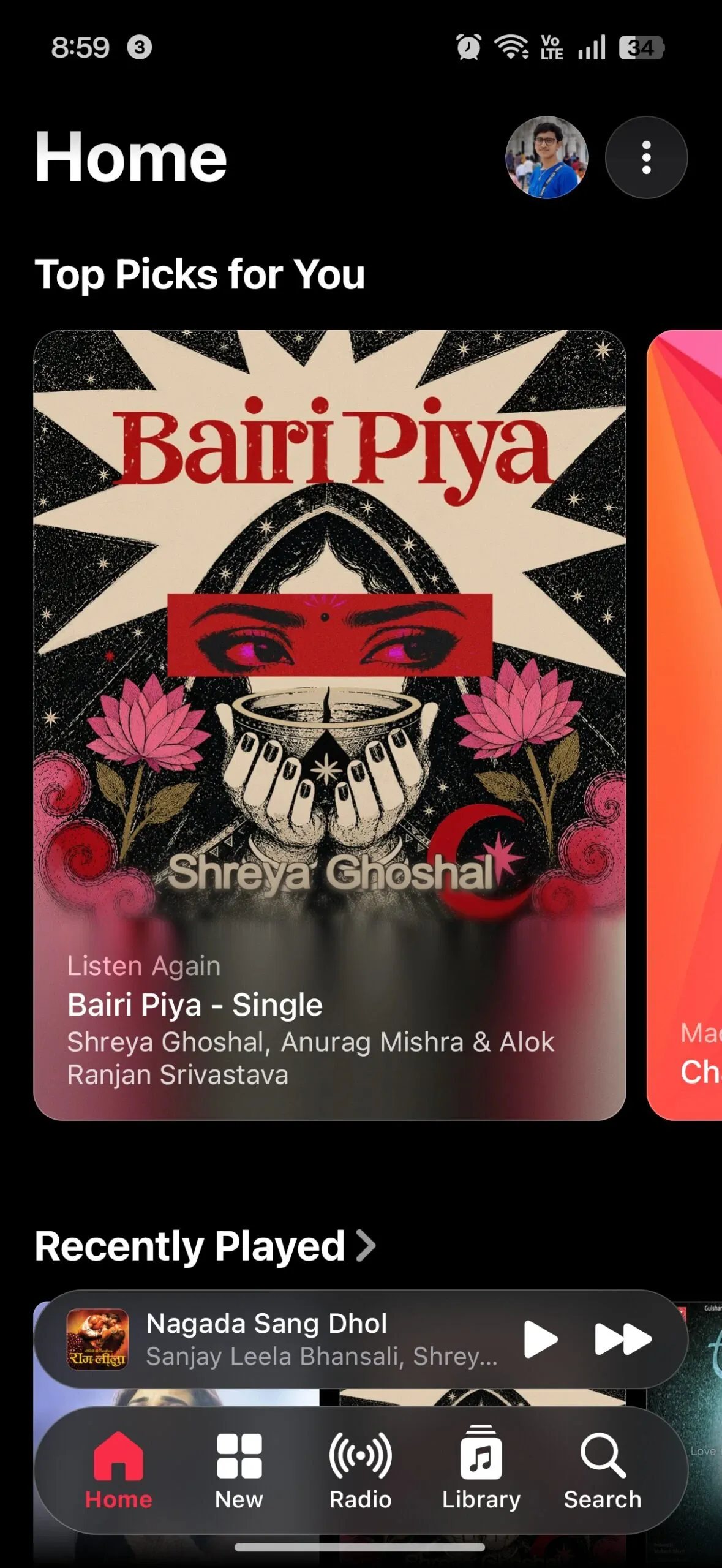 Photo: androidheadlines.com (source)
Apple Music has maintained an active presence on Android since launching in late 2015, frequently serving as an unexpected testing ground for new digital audio features. Over the years, the Android build was among the first to gain lossless audio, spatial audio with Dolby Atmos, and SD card offline storage caching. Despite audio parity, however, the visual experience frequently lagged behind Apple’s native ecosystem.
When Apple debuted its Liquid Glass interface language across internal platforms in 2025, third-party operating systems remained stuck on flatter, segmented layouts. Earlier intermediate builds on Android incorporated subtle elements like rounded pill buttons, but omitted genuine optical refraction. The release of version 7.0 also standardizes the version numbering system directly with Apple’s internal platform cycle, jumping numbers to align with iOS 27.
Comparing Android vs. iOS and the Competition
While Apple Music 7.0 brings the Android app closer to iOS than ever before, the port is not an exact one-to-one behavioral duplicate. On iOS, the floating Liquid Glass navigation bar dynamically collapses into an ultra-compact mini-pill when a user scrolls through long feeds, expanding only when scrolling halts or reverses. On Android, the floating bar remains fixed at its full dimensions regardless of scroll behavior. Furthermore, deep interactive fluid gestures available on iOS menus are not present in this build.
Compared to its primary rivals on Android—Spotify and YouTube Music—Apple Music stands out by largely ignoring Google’s native Material 3 Expressive design tokens in favor of its own aesthetic.
- Pricing: At $11.99 per month for individual plans, Apple Music undercuts Spotify Premium ($12.99 per month) while offering 24-bit/192kHz lossless streaming at no additional fee. YouTube Music stands at $10.99 standalone (or $13.99 bundled with YouTube Premium).
- Navigation Style: Spotify continues using a standard bottom bar integrated into the app canvas, while YouTube Music relies heavily on Material You dynamic color theming. Apple Music 7.0 leans heavily into depth and translucent blur.
Community and Industry Reactions
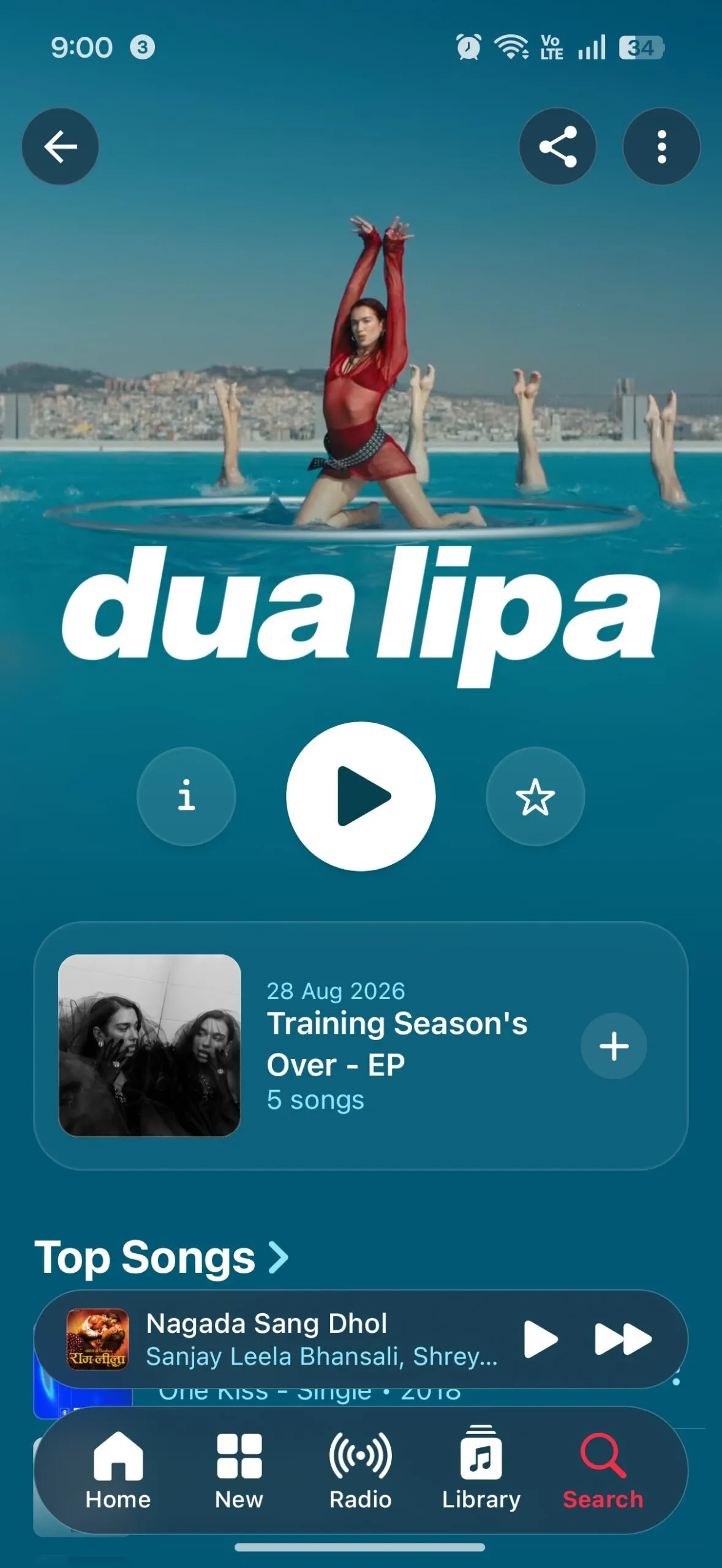 Photo: androidheadlines.com (source)
The update has sparked widespread discussion across Android and Apple user communities. Many Android subscribers welcomed the refresh, praising Apple for maintaining premium UI standards across competing hardware rather than shipping a neglected web-wrapper port. The fix allowing songs to stay in custom playlists when removed from the general Library drew unanimous praise as a long-overdue quality-of-life update.
However, the design language has seen pushback from design purists. Some Android users criticized Apple for bringing a Cupertino-first Liquid Glass design system into Android rather than following Google's native Material You guidelines. The ditching of the 10-year-old magenta-red branding has also divided listeners, with critics arguing the new black-and-white icon feels corporate and lifeless, while proponents argue it blends cleanly into modern home screen themes.
What This Means for Users
For daily Android listeners, the upgrade offers both functional convenience and visual refinement. Navigating dense catalogs feels faster due to edge-to-edge layouts and streamlined header toolbars. Curating custom playlists is significantly less stressful now that library cleanup operations won't break existing tracklists.
Users do not need to alter their subscription tier or reinstall the app to receive these features. Google Play is deploying version 7.0.0 as a staged global update. If the update has not yet populated on your device, clearing the Play Store cache or waiting for the staged server rollout will deliver the build over the coming days.
What Happens Next
With Apple Music 7.0 out the door, attention turns to the remaining features absent from the Android build. Listeners are still waiting for Apple’s DJ-style AutoMix feature, which remains unavailable on Android as playback transitions default to standard crossfade.
Additionally, the deployment of Liquid Glass within Apple Music raises questions about Apple’s broader Android software footprint. Observers anticipate that Apple's standalone Apple TV streaming application on Android may soon receive a similar translucent visual redesign to harmonize the company's cross-platform services ecosystem.
FAQ
How do I get the Apple Music 7.0 update on Android? The update is rolling out broadly through the Google Play Store. Check the "Manage apps & device" section in Google Play to download the version 7.0 update as it reaches your device.
Why did the Apple Music app icon change from red to black and white? Apple officially rebranded Apple Music's identity in October 2026, pairing a fluid, sound-wave-inspired music note with a monochrome palette designed to complement translucent Liquid Glass styling across screens.
Does removing a song from my Library still delete it from my playlists? No. Starting with Apple Music 7.0, you can remove any track from your general Library collection while keeping it preserved inside your custom playlists.
Does Apple Music on Android have AutoMix yet? No. Version 7.0 continues to use traditional crossfade settings, and Apple has not yet brought the automated AutoMix feature over to Android.
Does the navigation bar shrink when scrolling on Android like it does on iOS? No. Unlike iOS, where the Liquid Glass bar shrinks into a compact capsule during scrolling, the navigation bar on Android remains static and visible in its full dimensions.